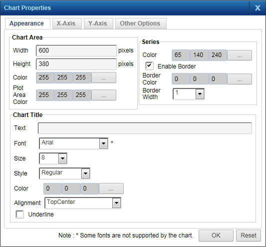
The Chart Properties dialog box is where you select different settings for displaying the chart. You can change the colors for bars, columns, lines, or points in the chart. The chart title and the various values to be displayed on the chart can also be formatted. You can also configure the chart to be drawn as a 3D image.
|
1.
|
 |
|
Click the button beside this field to select a color for the chart background.
|
|
|
Click the button beside this field to select a color for the grid area background. This color displays only in the area reserved for drawing the chart.
|
|
|
In the Series section, click the button beside this field and select a color for the bars, columns, lines, or points.
|
|
|
Select this check box if you want the bars, columns, lines or points of the chart to be drawn with a border.
|
|
|
Click the button beside this field and select a color for the border for the bars, columns, lines, or points.
|
|
|
Click the button beside this field and select the font color for the chart title.
|
|
|
Select the position from this list where you want the chart title to be displayed.
|
|
 |
|
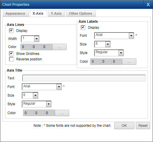
Click the button beside this field and select the color for the axis lines on the chart.
|
|
|
Select this check box if you want to reverse the placement of the axis on the chart.
|
|
|
Display (Axis Labels)
|
Select this check box if you want to display the axis labels on the chart.
|
|
Click the button beside this field and select the color for the axis labels on the chart.
|
|
|
Click the button beside this field and select the font color for the axis title.
|
|
4.
|
Click the Y-Axis tab to select settings for the y-axis on the chart. The Y-Axis tab has the same fields and options as the X-Axis tab.
|
 |
|
7.
|
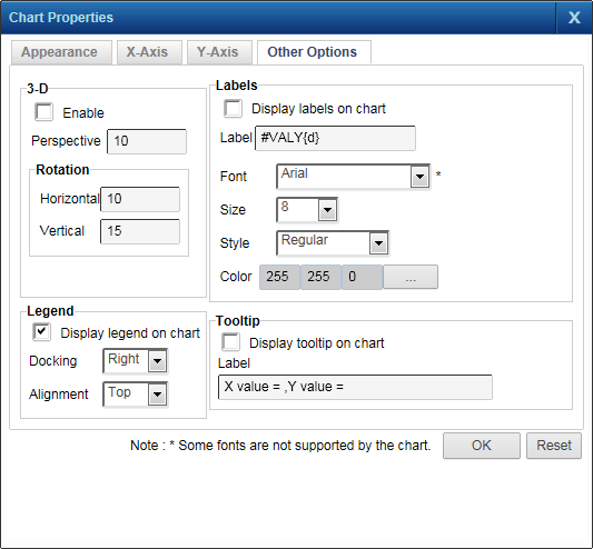
When finished, click OK and click the appropriate chart icon to view the chart.
|